
I don’t have a hundred logos to scroll past. Here are a few projects I actually stand behind, and none of them happen to be a coaching practice or a supplement brand. The problems underneath are the same ones though, so read them for the thinking, not the industry.

CASE STUDIES

OasisEye Specialists

OasisEye Specialists started an vision by three passionate consultant ophthalmologists who really care for their patients experience.

They needed an identity that captures this vision of what OasisEye stands for, not just to launch well. Professional enough for referring doctors, approachable enough for a nervous first-time patient, and simple enough that his team could apply it consistently without a design degree between them.

"The identity still reflects how we want OasisEye to be perceived, professional, relatable, and easy for the public to recognise. We've been using it consistently across all our materials, and continue to follow the original guidelines."
Dr Kenneth Fong
OasisEye Specialists

Philip Liew & Co

Lisa didn’t need a louder brand. She needed a clearer one. Before the refresh, explaining what the firm actually did took longer than it should have, both to prospective clients and sometimes to the team itself. Any coach or consultant who’s re-explained their own methodology on a discovery call for the hundredth time will recognise this one.

We rebuilt the site around what the firm offers, said plainly, so it stopped being something Lisa had to explain from scratch on every call.

"The refreshed website aligns well with our brand and services. Our offerings are now communicated more clearly, making it easier for prospective clients to understand the value we provide. The project was managed seamlessly from start to finish, and we were able to achieve what we set out to do."
Lisa Liew
Managing Partner, Philip Liew & Co
When the problem is clear, the right decisions follow.

philipliew.com.sg

A content-heavy site that needed clearer focus.

The site wasn’t broken, but as the business evolved, it needed to guide visitors more clearly through its services.

With constraints on how services could be presented, the focus was to restructure the content so it remained clear, compliant, and easy to navigate.

The result is a site that feels more structured, easier to move through, and clearer in how information is presented.

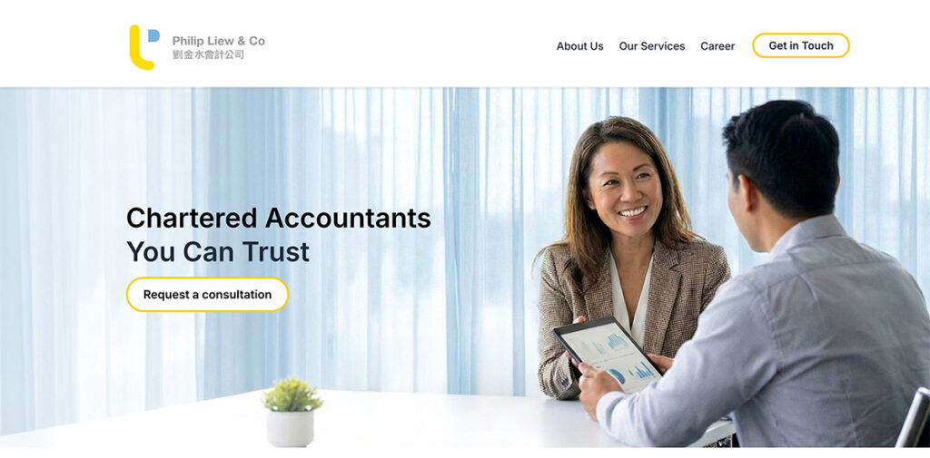
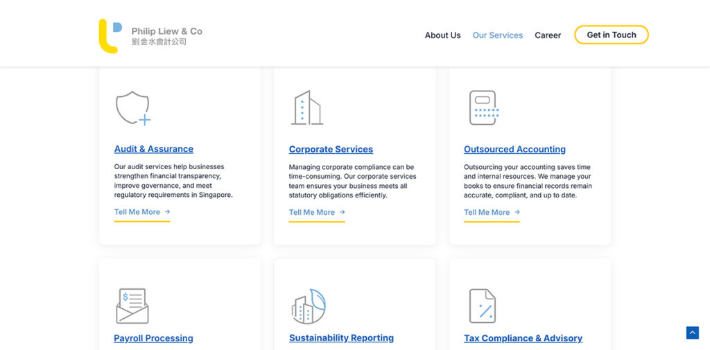
Homepage of Philip Liew & Co website showing service categories and navigation

Earlier version

Homepage of Philip Liew & Co website showing service categories and navigation

Clarified the homepage so visitors immediately understand what Philip LIew & Co offers.

Reorganised services into clearer categories, with custom icons to improve how quickly users can scan and find what they need.

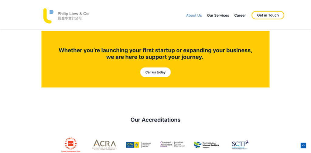
Placed clear calls to action alongside accreditations to build trust and guide users towards taking the next step.

This is the kind of work I’ve been doing.

Formally trained in graphic design, now working across brand and UX
helping businesses become clearer, more trusted, and easier to act on.

Yume Sanctuary

Yume needed a name and identity that could hold two things at once: a space to slow down, and a business that still needed to run like one. If that sounds familiar to anyone building a retreat, a program, or an experience-led brand, it should.

We worked through what “Yume” actually meant to Mei Kheng before we touched a single visual. The name itself became a talking point. People ask about it, she explains it, and they understand the sanctuary a little better before they’ve even walked in.

"People are often curious about its meaning, and after I share what Yume is about, they love it even more. It reflects what Yume stands for, creating a space where people can slow down, engage meaningfully, and benefit from the experience."

Mei Kheng (MK) Lee
Yume Sanctuary

Liked what you saw? Let's talk about yours.